createMaterialBottomTabNavigator
A material-design themed tab bar on the bottom of the screen that lets you switch between different routes. Routes are lazily initialized -- their screen components are not mounted until they are first focused.
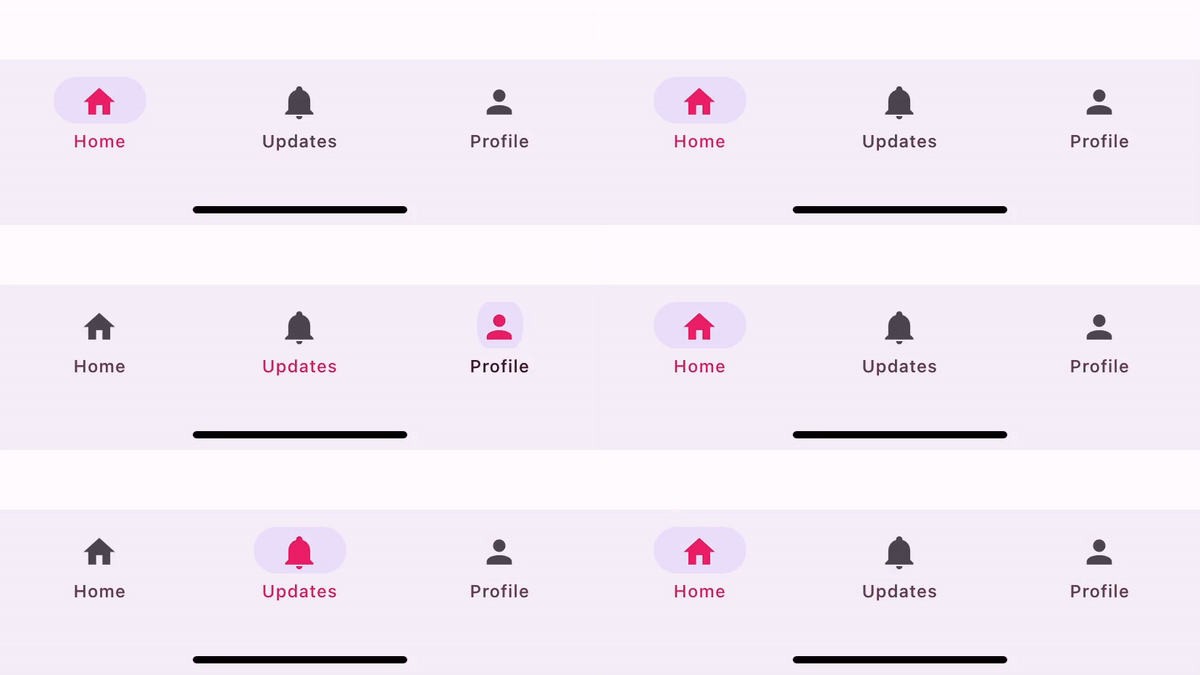
To use this navigator, you need to install react-navigation-material-bottom-tabs
 npm
npm yarn
yarn pnpm
pnpm bun
bun
npm install react-navigation-material-bottom-tabs react-native-paper
yarn add react-navigation-material-bottom-tabs react-native-paper
pnpm add react-navigation-material-bottom-tabs react-native-paper
bun add react-navigation-material-bottom-tabs react-native-paper
This API also requires that you install react-native-vector-icons! If you are using Expo, it will just work out of the box. Otherwise, follow these installation instructions.
To use this tab navigator, import it from react-navigation-material-bottom-tabs
import { createMaterialBottomTabNavigator } from 'react-navigation-material-bottom-tabs';

createMaterialBottomTabNavigator(
  RouteConfigs,
  MaterialBottomTabNavigatorConfig
);
This library uses the BottomNavigation component from react-native-paper. It doesn't include the whole react-native-paper library in your bundle, so you don't need to worry about it.
RouteConfigs
The route configs object is a mapping from route name to a route config.
MaterialBottomTabNavigatorConfig
shifting- Whether the shifting style is used, the active tab appears wider and the inactive tabs won't have a label. By default, this istruewhen you have more than 3 tabs.labeled- Whether to show labels in tabs. Whenfalse, only icons will be displayed.activeColor- Custom color for icon and label in the active tab.inactiveColor- Custom color for icon and label in the inactive tab.barStyle- Style for the bottom navigation bar. You can set a bottom padding here if you have a translucent navigation bar on Android:barStyle={{ paddingBottom: 48 }}.initialRouteName- The routeName for the initial tab route when first loading.order- Array of routeNames which defines the order of the tabs.paths- Provide a mapping of routeName to path config, which overrides the paths set in the routeConfigs.backBehavior-initialRouteto return to initial tab,orderto return to previous tab,historyto return to last visited tab, ornone.
Example:
export default createMaterialBottomTabNavigator(
  {
    Album: { screen: Album },
    Library: { screen: Library },
    History: { screen: History },
    Cart: { screen: Cart },
  },
  {
    initialRouteName: 'Album',
    activeColor: '#f0edf6',
    inactiveColor: '#3e2465',
    barStyle: { backgroundColor: '#694fad' },
  }
);
navigationOptions for screens inside of the navigator
title
Generic title that can be used as a fallback for headerTitle and tabBarLabel.
tabBarIcon
React Element or a function that given { focused: boolean, horizontal: boolean, tintColor: string } returns a React.Node, to display in the tab bar. horizontal is true when the device is in landscape and false when portrait. The icon is re-rendered whenever the device orientation changes.
tabBarColor
Color for the tab bar when the tab corresponding to the screen is active. Used for the ripple effect. This is only supported when shifting is true.
tabBarLabel
Title string of a tab displayed in the tab bar. When undefined, scene title is used. To hide, see labeled option in the previous section.
tabBarAccessibilityLabel
Accessibility label for the tab button. This is read by the screen reader when the user taps the tab. It's recommended to set this if you don't have a label for the tab.
tabBarTestID
ID to locate this tab button in tests.
tabBarOnPress
Callback to handle press events; the argument is an object containing:
navigation: navigation prop for the screendefaultHandler: the default handler for tab press
Useful for adding a custom logic before the transition to the next scene (the tapped one) starts.
Using with react-native-paper (optional)
You can use the theming support in react-native-paper to customize the material bottom navigation by wrapping your app in Provider from react-native-paper. A common use case for this can be to customize the background color for the screens when your app has a dark theme. Follow the instructions on react-native-paper's documentation to learn how to customize the theme.